Formatting
Our tool currently accepts csv files. Ensure all excel files are saved with this extension (.csv). If there are numbers in your file that include commas, these commas must be removed in Excel before uploading to the site. For instance "1,000,000" should be reformatted to "1000000". Additionally, other special characters should also be removed.
The first column in your file should be used for headers, or ordered in some way (date/time). The rows in the first column will be displayed in the same order as the original file. After the first column, the following columns are used as y-values where each column is its own dataset.
The 'Creating Data' option provides two ways to create your data. There's a table view as well as a text view. Both views enable you to copy & paste / drag & drop from a spreadsheet application like Excel.
The table view requires you to right-click on the table to bring up a menu for adding/removing rows and columns. This table works mostly like Excel tables. Headers (the first row) must be renamed through right-clicking them, since double-clicking it changes the ordering. Tables cannot contain any unused columns or rows, so it's best to delete anything additional. While the chart may still show, doing so will result in a chart that doesn't accurately reflect your data to the fullest capacity.
The text view supports both csv format and tsv format. Since there's no need to right-click a menu and rename the headers, it may be easier using this view if you are just copying & pasting / dragging & dropping data from Excel without making any other changes.
Customizing Charts
In addition to titling the chart and naming the x & y axis, further customization options are also available.
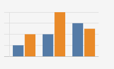
Choose a Color Scheme
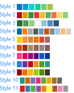
Selecting a color scheme will apply a color palette to your datasets, where every dataset is represented by a different color. In the picture below, the blocks for any given style represent the order in which the colors will be applied. If the number of datasets is greater than the number of colored blocks for any given style, then the color scheme will loop and reuse the same colors.
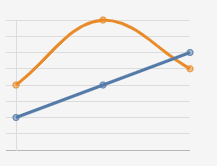
Creating Mixed Charts
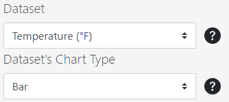
After choosing an initial chart type and reaching the chart screen, use the two dropdown menus pictured below to choose specific datasets and change their corresponding chart type.
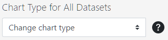
Furthermore, if you want to change the chart type for every single dataset at once, use the dropdown menu pictured below for convenience.
Interacting with Charts
For cluttered charts, there are three key ways to focus in on certain features.
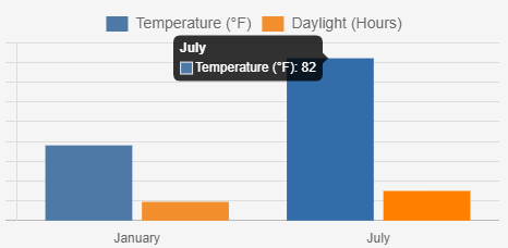
View Specific Values
Hovering over any piece of data on a chart will bring up a tooltip that displays the specific values for that data.
Zooming & Panning
Use the scrollwheel on your mouse to zoom into a chart. Click & drag on the chart to pan. Click the 'Reset Zoom' button to revert the chart back to its original state. As a side note, these features work best on smaller datasets. Zooming is limited on charts with more than a few hundred pieces of data.
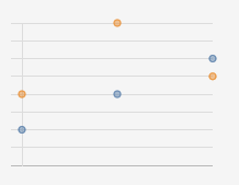
Focus on a Dataset
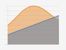
Sometimes, overlapping data can make it difficult to see the entirety of any given dataset even when different colors are applied.
Look at the chart below.
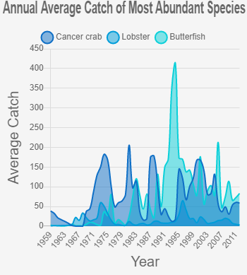
This chart uses a subset of data from a Narragansett Bay Fish Trawl Survey. While the original file contained more than twenty datasets and this one only has three, it can still be difficult to see any one dataset clearly.
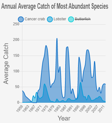
Clicking on a dataset in the legend will hide/show that dataset. For files with many datasets, this can be useful for uncluttering the chart. The picture below uses that same data as the chart above. But now, one dataset is hidden from view.
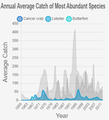
Hovering over a dataset in the legend is also an effective way to focus on one specific dataset. Doing so will turn all other datasets on the chart transparent, thus bringing one dataset into focus. For cluttered data, this feature can be effective for visualizing one dataset, while still being able to see the overall trend of other datasets.
Additional Features
If the rows of your columns are greater than 150, your chart's styling will be altered to help prevent clutter. For example, the points in a scatter chart will be smaller, and the lines in a line chart will be thinner.
If the header names used for the x-axis are too long, they will be truncated. This prevents long x-axis names from crunching the chart. If a header is truncated, it will end with an ellipsis to show it has been cut off. You can still see the original name by hovering over the point itself.